
Image as Persuasion
DVB102 | Week 4 | #oneperday19 | Images 11 - 15
For this week... We looked at image as a tool for persuasion!
Our task was to create a poster for a cause of choice we want to attract people to join. For our 5 images, 3 of these had to be rough sketches while the other 2 had to be finalised coloured and one-coloured versions. Lastly, we were given the choice to do them digitally or traditionally!
What am I selling? / What is my audience?
For this week's theme, I've decided to do parody, advertising posters for Klasse14's watches (where the brand will be just called "Kl☆sse" for this parody-purpose)
Klasse14 (2019) is a luxury goods & jewelry brand that strives to create fashion-forward products of outstanding quality where, each one-of-a-kind design is crafted to exude both style and provides an avenue for people to express their love and thoughtfulness to their close ones. Wearing time on our wrists means that we capture and treasure these moments and keeping those close to our hearts. Furthermore, Klasse14 (2019), also strives to inspire a new generation of creative personalities as well as enhance the richness of life with an alternative luxury.
Audience-wise, I chosen young adults (mainly women) aged 20-25, who are of high socioeconomic status (high SES). The audience of the posters can also be mid-to-late teenagers aged 15-19 who are a fan of popculture and anime due to the style that the posters were drawn in.
IMAGE 5
Final Poster - Full Colour Ver.

MATERIALS
Programs: Paint Tool SAI2 + Photoshop (for final colour adjustments)
Surface Book 2
Surface Pen
Artist Glove
EXTRA INFO
Duration: ~8 hours (from 3 preliminary sketches to final versions)
PROCESS
- I chose one of the 3 sketches to further finalise
- I lowered the opacity of the sketch and outlined it
- After outlining, I'd plot out the base colours
- After base-colours, I shaded it
...please see timelapse video below for process, it is better to see "how" visually
Watch the process from sketch to final here!
Phases: Iteration → Lineart → Base-Colour → Shaded (Final!)


SUCCESSES - WHAT I THINK I DID WELL
- Overall, I think the final coloured poster turned out pleasingly well! I am proud at how the colouring turned out and the colour-choices + contrasts made to have the model stand out. I am also pleased with the overall composition that allows room for the text and the product (watch) to be positioned standalone from the model.
... oh! I just want to say that I simply love the eyes - I find them pretty! \\(☆ v ☆)//
FAILS - WHAT COULD BE DONE BETTER
- Overall, what I think could be done better is the overall persuasive-ness of the poster. Fashion advertisements from make-up, hair to skin products as well as clothing and accessories often use a famous person or glamour/beautiful model to associate their products with. This in-turn attracts and entices their audiences along the lines of "If ___ wear/uses this then so will I" or "If i use/wear this, then I will be pretty like them!" or can boost confidences, sense of empowerment and esteems...
I feel the the overall advertisement is more of a pretty illustration that doesn't seem to hold any more meaning or emotion beyond that. Though, I feel like the modality of the poster can be improved by changing the text from "Have Klasse, Stay Klassy" to perhaps "Get Klasse, Be Klassy."
"Have/Stay" sounds too passive compared to "Get/Be" which seems more front-forward as the advertisement is meant to offer the audience something (the watch) and have them do an action which is to "buy it" in order to "be + have Klasse"...?
RATIONALE
Why was this idea the best? How will the visual elements appeal to audiences?
- I decided to choose the 1st sketch out of my preliminary ideas because of it's overall composition. The model is positioned in the centre of the page for "main focus." The model also stands out because of the positive-space created with the boxed-yellow background behind.
- Another reason is the model's pose. By having the left arm (aka her right) across then resting on the right (aka her left shoulder), it draws attention to the watch.
- Another is the the use of text and product placement which creates a sense of balance on the page for how the audience reads + scans it and determines that this is an ad.
Overall? I particularly chose this sketch as the following reasons altogether form the Z-Rule where we read from top-left to right then bottom-left to right. This "Z" is formed as we look at the model's eyes first then down to the right earring (her left) as her finger had flicked it. From there, we see the words " Have Klasse." Our eyes then follow down her arm, past the watch. Our gaze then meets her other hand pointing down to the "Stay Klassy" text then finally, we meet the product advertised.
What would create a stronger emotional connection to audience?
For a stylish-luxury watch brand, I decided to use colours which create a strong emotional connection to the audience in terms of emphasising the product's worth and value.
The main colours of this poster is: Brown, Purple, Yellow. These following colours have their own symolic meanings which is a reason for choosing them. Brown and Purple in-particular are both colours of richness and luxury (Centeno, 2016)
Brown = Richness, simplicity, reliable
Purple = Luxury, quality, creativity
Yellow = Creativity, confidence, wealth
I chose green for the eyes to tie it altogether and have that feature stand out and allow its intricate details attract attention.
Lastly, I chose to draw the illustration in an art program like SAI so I can add all the intricate sparkly details. This is opposed to Adobe Illustrator where it is more vectors and flat-graphical image based?
IMAGE 4
Final Poster - Black and White Ver.

PROCESS
1. I did the outline over the sketch
2. After that I selected areas to colour black and white
3. Then I recoloured some of the lines of the outline from black to white
RATIONALE
For "colour", I decided to do black and white. The overall background is black in order to draw in focus of the contents of the poster such as the model who is coloured white. I also chose black and white for their symbolic meanings as well. Both mean purity and simplicity which also fits the elegant feel of the luxury brand as they mean glamour, sophisication, elegance and respect (Cemento, 2016).
...and side note, for successes, I particularly like how the watch looks in this - gives an overall night/starry-feel? For fails, the positioning of the text "Stay Klassy" seems too cluttered around the space as the word "Stay" is awkwardly placed behind the model's finger?
IMAGE 1
First Iteration

PROCESS
1. Anatomy guidelines
2. Drew from eyes first then hair to body
3. Scribbled text
RATIONALE
Refer to finalised.
IMAGE 2
Second Iteration

PROCESS
...same process from guidlines, eyes, hair, body to text
RATIONALE
Here, I attempted for a fantasy feel? Like, a maiden aka a woman looking out the window. Which from here, I had the intention to draw the audience's attention from her eyes to the watch she is looking at (that is product placement). I did not go forward with this as the attentions seem awkward and forced as well as detail of the brick walls which may look too cluttered and not as simplistic. Overall, this image would fit better as an illustration inside an artbook or CG art for games because it is sceneric - not so much advertisment.
IMAGE 3
Third Iteration
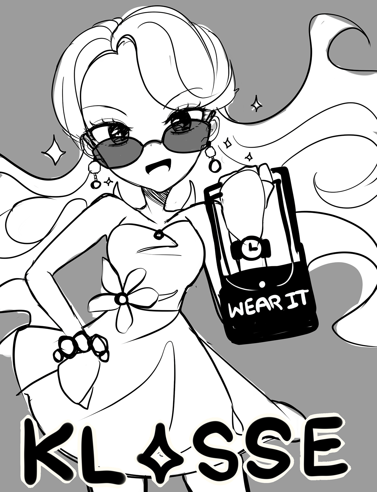
PROCESS
I decided to duplicate the model from the 1st sketch. I erased everything apart from her face. Otherwise, same process from guidlines, eyes, hair, body to text
RATIONALE
I decided to re-use the model from the 1st sketch to experiement with how I can communicate the poster differently and overall, having a more glamour(?) approach such as a the sunglasses, fancy dress and overall confidence pose with wind blowing through the hair. I also experimented with having high-modality action-words on the handbag.
REFERENCES
1. Klasse14. (2019). About. Retrieved from https://www.linkedin.com/company/klasse14/about/
2. Centeno, C. (2016). Lose the Color Symbolism Chart: The Unpredictable Meanings of Colo. Retrieved from https://conversation.pposinc.com/2016/07/06/lose-color-symbolism-chart-unpredictable-meanings/


